HCDD 364W Class Group Project
Karina Field, Claire Keef, Avery Dayal, and Marcela Ramirez Vadillo
Overview
As part of Penn State’s HCDD 364W class, which emphasizes user research through a combination of concepts, methods, data collection, analysis, and both qualitative and quantitative techniques, our team explored a common challenge college students face: managing multiple streaming services during their limited free time.
We collaborated using a range of research methods including observations, interviews, contextual inquiries, task analyses, surveys, usability testing. Throughout the process, we experimented with various tools such as AI‑assisted testing, unmoderated and moderated usability sessions, and both low‑ and high‑fidelity prototypes.
Through this research, we came up with the design question: How might we empower college students to take control of their streaming services?
Our final project addresses this by bringing all viewing options into one place, organizing everything users are subscribed to and enhancing it with features like cross‑service search, a unified watchlist, subscription management, a calendar, and personalized short‑clip content navigation. Orbit creates a personalized experience that helps users understand what’s available to them based on their subscriptions and preferences, adding clarity and convenience to the streaming experience.
Problem
- Students struggle to know what to watch, where it’s available, and how to access it.
- Busy schedules and high stress levels make it overwhelming and time consuming for students to search across platforms offering different shows, movies, and live events.
- This frustration takes away from the convenience streaming is supposed to provide.
Methodology
- Analyzed the design problem and identified stakeholders.
- Planned and conducted contextual inquiries with targeted users.
- Developed user research reports.
- Designed questionnaires and surveys.
- Created low and high-fidelity prototypes.
- Wrote usability test scripts with appropriate introduction, warm-up questions, scenarios and tasks.
- Hosted Zoom sessions to perform moderated usability tests.
- Created a moderated usability test using Userology.
- Created an unmoderated test in UserTesting.
- Analyzed qualitative and quantitative findings from all tests.
Insights
- There is a limited user experience when searching for new or popular content that matches their preferences when users have to switch back and forth between different subscriptions.
- Subscription management is a key component when using multiple services as preferences, prices or content are constantly changing within subscriptions. There is no simple way to track subscriptions, until they already get billed for it.
Early Concepts
Research
Contextual Inquiry
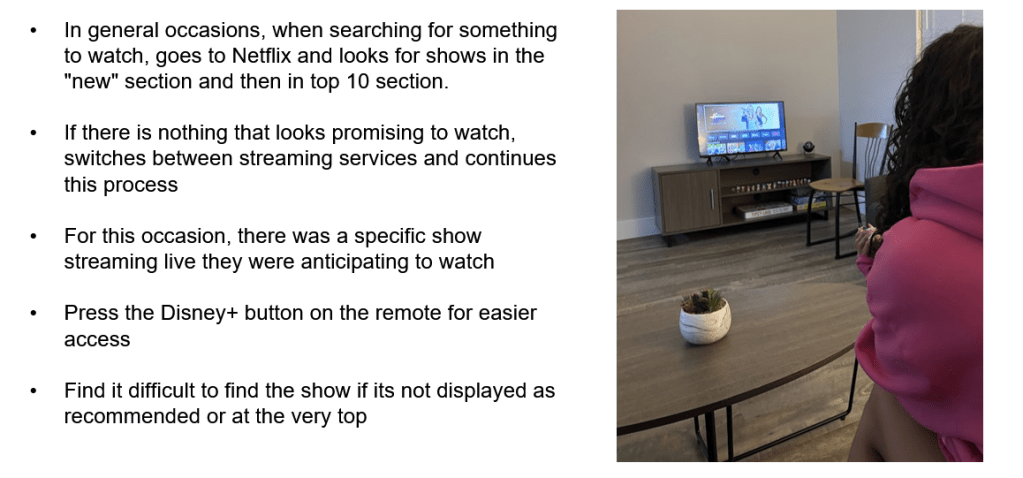
We observed college students who use their subscriptions on their TV. This familiar environment was effectively analyzed by observing authentic user interactions. The observation took place during a typical time when they watch shows or movies. To really capture a full range of user behaviors, it was preferable to include participants with different viewing preferences and various TV setups. This helped us identify common weak points in the user experience.
Focus areas:
- Number of subscriptions.
- Type of device.
- Users’ process of searching for new or popular content that matches their preferences.
- Subscription management.
- Watchlist, live events, releasing dates and recommendations navigation.
Surveys and Questionnaires
Each team member designed a questionnaire and a survey to help understand who the users are, their goals, their needs, their current practices, and their challenges when managing multiple streaming services. We included open-ended and closed questions, rating scale, Likert scale, and semantic differential scale.
We focused on device compatibility, personalized content recommendations based on watch history, users’ satisfaction when navigating their platforms and the search experience for specific content.
Analysis
We identified high-level activities, tasks, and themes that the users shared in common in their practices such as:
- Often switching between apps and relying on Google or TikTok to find content and where to watch them.
- Participants going to a streaming service and looking in their “most popular” and “new” sections when searching for recommendations.
- Users having issues when tracking subscriptions, remembering cancellations, and organizing what to watch next.
We used the A.E.I.O.U. Map to collect our contextual inquiry findings as it classifies data into Activities, Environment, Interaction, Objects, and User.
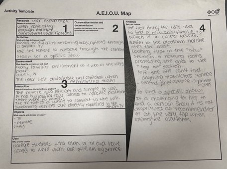
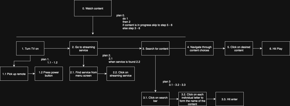
We also created a task analysis to classify shared understanding of users’ work processes, mental models, and common behaviors.
The user research helped to uncover the unmet needs and identify the representative tasks:
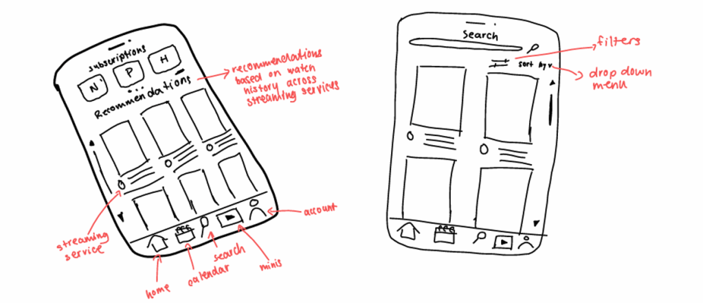
- Searching
- A universal search system, solving the mass issue of searching cross platform.
- Managing Subscriptions
- Different streaming services means different subscriptions and payments; therefore, it is often difficult to track them. College students living on a tight budget concluded that managing subscriptions and budgeting would be a core feature of the platform. Users will be able to receive summaries of their usage, once setup is complete.
- Tracking Watchlist
- Managing information and scheduling was another issue when having different subscriptions while being a college student. This helps users organize and plan their media consumption.
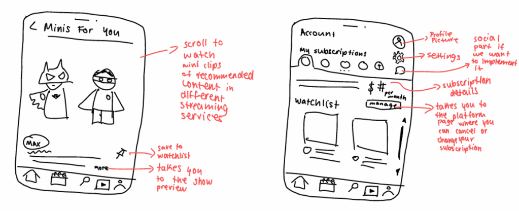
- Exploring Minis
- Short clips offer a quick, flexible way to browse recommendations. Because young adults often consume media in short formats, this feature supports efficient exploration and aligns with their viewing habits.
Usability Testing
We recruited participants for usability testing by asking Penn State students whether they currently use two or more streaming services. Since the use of streaming services is common among college students, we were able to recruit a sufficient number of participants for AI-conducted tests using Userology, unmoderated tests using UserTesting and moderated tests through Zoom .
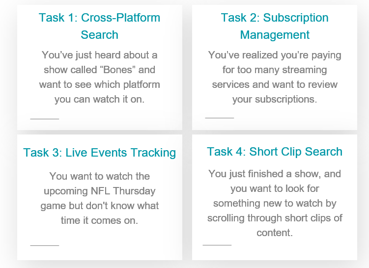
Usability testing objectives:
- Evaluate how easily users found shows across multiple streaming services.
- Test users’ ability to locate and interpret subscription management information.
- Asses how users located live events in the calendar.
- Understand how users would use our “minis” feature.
Overall, our usability testing showed that Orbit has a really strong foundation, and most users found the app easy to use, clean, and simple to navigate. The search feature was especially successful, participants kept saying it was fast, intuitive, and helped them quickly find where a show was streaming. The calendar was also well-liked for showing upcoming events, and users appreciated that subscription management put all their plans in one place without making the process feel stressful or confusing.
At the same time, our testing also uncovered a few important problem areas that caused confusion. Some participants weren’t sure whether Orbit actually played the shows or just tracked them, which means the purpose of the app wasn’t always clear. Others felt stuck in the search bar because there wasn’t a clear exit button. The biggest issues came from the calendar, users mixed up the watchlist with the calendar view, didn’t understand which icon led to live events, and expected the list view to be more chronological. Subscription management also had some clarity problems since users often clicked colored text, thinking it was a button, or didn’t realize what page they were already on.
Iterations
During our usability testing, we uncovered some issues in our prototype:
Watchlist
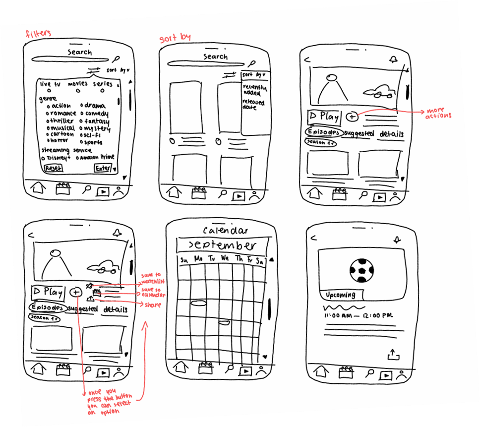
We noticed that participants had trouble finding the watchlist, due to it being under the calendar icon, so we moved a preview of it to the homescreen where users will be able to press “view all” to see their full watchlist page.
Search
In our main searching functions, we added various ”back” and “exit” buttons so users can restart their search or go back to the results page.
Calendar
We added a reminder action on the time blocks, so that users don’t need to be checking their calendar all the time and so they won’t miss an event.
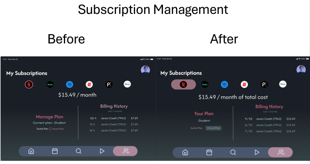
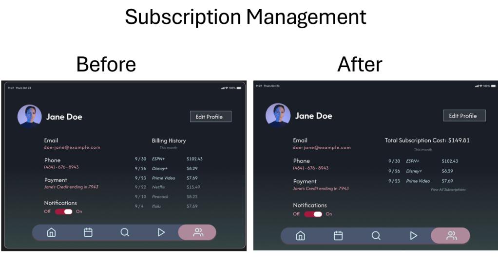
Subscription Management
In our billing and account page, we received feedback that users wanted to see how much they were spending in total per month, on top of viewing the per subscription price, so we added that constant price to the billing page. We also elevated the visibility of the cancel and switch plan button after seeing that our users hadn’t even noticed them during testing.